Floating Heads, Teal Sunsets, and the Cast Lineup: The Movie Poster Has Become a Paperwork Problem
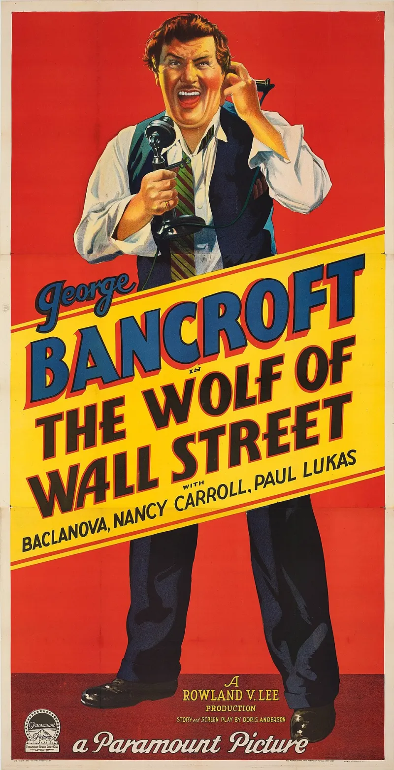
Photo: Paramount Pictures, Public domain, via Wikimedia Commons
Walk past a multiplex in 2026 and you'll see the same poster on every wall: five famous faces arranged in a diagonal line, a city skyline in teal, a sunset in orange, and a tagline that sounds like a fortune cookie with a marketing budget. The modern movie poster is not an invitation. It is a compliance document. It exists to prove that the stars were contractually available, the release date is real, and the genre has been approved by a committee.
The Cast Lineup Is Not a Poster, It's a Receipt
There used to be mystery. A poster could show a silhouette, a door, a shadow, a single eye. Now it shows the whole guest list. Here's the Oscar winner, here's the comedian doing a dramatic role, here's the young actor who will be franchise-ready by 2028. Everyone is arranged by billing order and head size. It looks less like art and more like a wedding photo where the photographer said, 'Okay, now everyone look slightly to the left and think about your quote in the press notes.'
The poster is selling the contract. It says: we have assembled these people, and you have previously enjoyed at least two of them, so please buy a ticket. It does not say what the movie is about. It does not even say what it feels like. It just says: available. Like a rental car.
Teal and Orange: The Universal Language of 'This Is a Movie'
I don't know who decided that every action movie should look like a bottle of sports drink, but they won. Teal shadows. Orange skin. A blue sky that has never been seen in nature. It's the visual equivalent of a laugh track: it tells you what to feel before you feel it. The poster is afraid you might mistake the movie for a documentary, so it color-codes the whole thing. Bad guys: blue. Explosions: orange. Romance: slightly warmer orange.
This is not a new complaint. People have been mocking teal-and-orange since the 2000s. But the poster has gotten worse in a different way: it has become aggressively legible. Every element is designed to be understood in 0.3 seconds on a phone screen. That means no negative space, no ambiguity, no weirdness. Just faces, colors, and a release date. It's not a poster. It's a thumbnail with a budget.
Minimalism Became the New Floating Head
For a while, the minimalist poster was the cool alternative. One tiny silhouette. A lot of white space. Helvetica. A single red dot. Everyone nodded and said, 'Now that's design.' And it was, for about fifteen minutes. Then every indie distributor and every streaming service started doing it, and minimalism became its own cliché. Now we get a poster of a lone figure standing in a void, with a tagline like 'Some secrets stay buried.' Congratulations. You have made the same poster as 47 other movies, but with more kerning.
The minimalist trend was supposed to be about confidence. It said: we don't need to show you everything. But most of the time, it's just a different kind of safety. It's the safety of looking tasteful. It's the safety of not committing to an image that might be weird. A blank poster with a tiny person is not mysterious. It's just empty.
Who Is This For?
The answer is not 'moviegoers.' It's for the marketing department, the international sales team, the theater chain, the streaming algorithm, and the star's agent. The poster has to work in a mall, on a phone, on a bus shelter, and as a 120x120 pixel ad next to a video of a guy reviewing a sandwich. It has to be recognizable in a language you don't speak. It has to say 'thriller' without saying 'thriller.' It has to make you feel like you already know what you're getting, even if you don't.
That's why the poster has given up. It's not trying to be memorable. It's trying to be safe. And safe is boring.
A Modest Proposal: One Image, No Names, Let Us Guess
Here's my proposal. Put one mysterious image on the poster. No floating heads. No cast lineup. No teal gradient. Just one image that makes me ask a question. A wet shoe on a curb. A key in a lock. A dog in a suit. A phone ringing in an empty room. Put the title and the release date. Maybe one tagline, if it's actually good. Then let me guess what the movie is about. Let me be wrong. Let me walk into the theater with a question instead of a checklist.
Will this sell tickets? Probably not. Will it make the poster memorable? Yes. Will it make me look twice? That's the whole job. The poster used to be the first scene of the movie. Now it's the receipt. I'd like the first scene back.